 (Image via
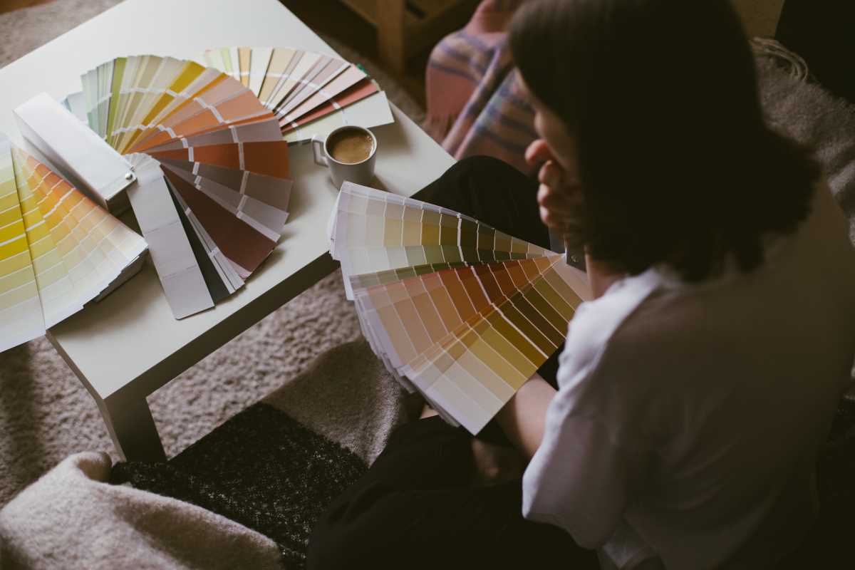
Choosing the perfect paint color for your home can feel both exciting and overwhelming. After all, the right color has the power to transform a space, setting the mood and reflecting your personal style. But with endless options available, where do you even begin? Don’t worry! With a little guidance and some practical tips, you’ll be well on your way to picking the perfect shade for every room in your home.
Start by Considering the Function of Each Room
Before you grab those paint swatches, take a moment to think about how each space in your home is used. Colors can affect the way we feel and function in a room, so it’s important to match your palette to a room’s purpose. For example, soft blues or greens are often relaxing and work well in bedrooms or bathrooms where you want a calming vibe. On the other hand, warmer shades like yellows or oranges can create a welcoming, energetic atmosphere, making them great candidates for kitchens or living rooms.
If you’re designing a home office, you might want to choose colors that promote focus and productivity. Neutral tones or muted shades of blue and green can help maintain a sense of calm without being distracting. Pay attention to how each color makes you feel and align it with the mood you want to create in that room.
Take Inspiration From What You Already Have
One of the easiest ways to narrow down your paint choices is to look at what’s already in the room. Your furniture, rugs, curtains, or even artwork can provide a great starting point for your color palette. Do you have a couch with bold, colorful cushions? Consider pulling a complementary shade from one of those patterns. Or, if you have a neutral-toned area rug, you could opt for a contrasting wall color to add depth.
This approach ensures your chosen paint color will harmonize with the room’s existing elements, creating a cohesive, polished look.
Test a Few Samples Before Committing
Paint chips at the hardware store can be deceiving. A color that looks great on a tiny card might feel completely different when covering a large wall under different lighting conditions. That’s why it’s essential to test a few samples at home before making a decision.
Pick up small sample pots of the colors you’re considering and paint swatches directly onto your walls. Use areas that get various amounts of light, like near windows or in corners, to see how the color shifts throughout the day. If you’re not ready to paint directly on the wall, try painting sample boards or large sheets of paper you can move around.
Taking the time to test colors might feel like an extra step, but it’s the best way to avoid regrets after the paint has already dried.
Think About the Lighting in Your Space
Lighting has a huge impact on how paint colors appear, so it’s crucial to factor this into your decision-making process. Natural light brings out the truest version of a color, while artificial lighting can warm it up or cool it down depending on the bulb type.
If your space gets a lot of sunlight, lighter shades will glow beautifully in the daytime. However, in darker areas with minimal natural light, bright or saturated colors can help add vibrancy. Pay attention to how your chosen paint looks under the lighting you’ll actually use in the room.
Don’t Be Afraid of Neutrals
While bold colors can be exciting, neutrals are incredibly versatile for all types of spaces. Classic shades like whites, beiges, grays, and soft greiges (a mix of gray and beige) provide a clean, timeless foundation that allows your furniture and décor to shine.
If you’re worried about neutrals feeling too plain, consider layering textures or adding accent walls in more dynamic hues. For example, a beige living room can be paired with a deep navy or mustard yellow accent wall for a modern touch.
Keep a Consistent Flow Between Rooms
When choosing paint colors, it’s important to think about how different rooms connect and flow into one another. The more cohesive your palette, the more your space will feel unified. This doesn’t mean every room needs to be the same color, but you might want to choose shades that complement one another.
For instance, a living room painted in a warm taupe can transition seamlessly into a dining room in a soft, dusty rose or muted terracotta. Using similar undertones helps create a sense of harmony throughout your home.
Don’t Forget Your Ceiling
Ceilings are often overlooked in the painting process, but they’re a crucial part of any room’s design. While the default ceiling color is typically white, you can get creative by painting it a shade lighter or darker than your walls for a cozy, tailored effect. For extra drama, a bold ceiling color can make a statement and add character to unexpected spaces like a home library or powder room.